Painting Your Home
The Art Of Painting Your Home
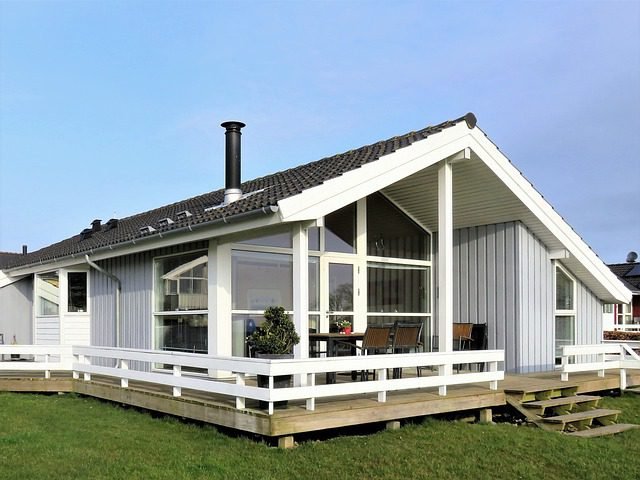
It’s common that a fresh coat of paint adds a little boost to the sale price of your home. We frequently find a recent paint job has taken place when evaluating a house or apartment that’s for sale. I think it’s fair to say that we would be concerned if that was not the case.
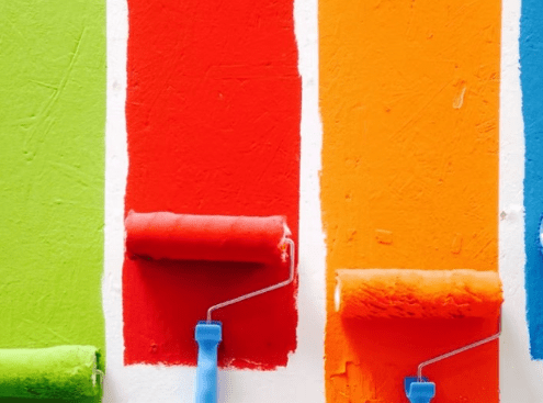
A real estate agent that does not recommend a new paint job as an improvement/upgrade to a client prior to sale is as rare as rocking horse poop. After all, painting your house is a low-cost way to give it a quick facelift. Unfortunately, some people take shortcuts, use inferior products, or simply don’t know what they’re doing from time to time, and their painting efforts can end up causing more problems than they solve.
A cheap coat of poor quality paint over old varnish, or an acrylic topcoat applied over enamel without an undercoat, might not even last until the open home inspections have finished. How incredibly embarrassing would it be to have future buyers of your home pointing out peeling or chipping of your paint job? If this happens, you’ll have to scrape everything away and start over, which will double your painting costs.
So what we really need is quality preparation and a top-notch paint job done by people who know what they’re doing using quality products.
Use paint that is Cruelty Free & with no Volatile Organic Compounds (VOC)
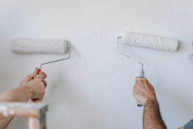
Whether you do the painting yourself or hire a professional, you should limit the paint products you use to those that are completely free of animal by-products. If you don’t want headaches or other health effects from paint fumes, choose a paint that is more than 99% free of air-polluting Volatile organic compounds and harsh chemicals like formaldehyde, glycol ethers, phthalates, crystalline quartz silica, silicones, ammonia, and Teflon.
What colours will work best with your home?
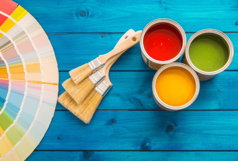
Why do we find one colour pattern appealing while another is unsettling? What makes us prefer one product over another? Colour is everything, whether in architecture or commerce; it accounts for 60% of our reaction to an object or a location. The study of which colours have the most positive effect on us is known as colour psychology. Colour has both subtle and significant physical and psychological effects. Contrary to popular belief, colour usage does not result in a definitive relationship between “colour and our moods.” Colour affects us wherever we go, though its importance is often overlooked.
Take your time and experiment with your colour options.
We place a high value on the use of colour in our homes and workplaces. If you’re unsure where to begin, experiment with colour in a utility room, small bathroom, small hallway, area between rooms, or accent wall. If you’re painting on your own, choose a quick-finish area so you can see your results and decide whether you like them right away.
Don’t get bored with this process and quit; it’s far better to spend a few hours testing now than multiple days later repainting a house.
How do you want the room to feel?

When selecting a colour, consider the overall tone of the room. Do you want your bedroom to be soothing and restful, or dramatic and intimate?
Stronger colours are used to create a more dramatic effect, whereas soft, cool hues and neutrals are used to create a more relaxing atmosphere.
Do you want your dining room to be informal and lively, or formal and quiet? Warmer, more contrasted, and slightly brighter colours create a more warm atmosphere, whereas deeper blue-greens and neutrals create a more formal atmosphere.
Consider the colours you use to paint your children's rooms.

Do you want your children’s bedroom to have an active and thrilling energy or a calm and relaxing atmosphere? Make sure your children aren’t over stimulated by very bright colours. Brighter colours might cause agitation and impatience, even if you aren’t aware of it.
You can get a very good idea of the finished colour at good paint shops. Some paint retailers offer light boxes where you can test paint chips, this is to try and replicate your home lighting environment. Natural daylight displays the most accurate colour, incandescent lighting highlights warm tones and yellows, and fluorescent lighting casts a bright blue hue. When used on all walls or next to a large window, a bold hue may be excessively bright and overbearing, but it may be excellent when used as an accent wall with indirect light.
Understanding the language of colour

It is beneficial to have a basic understanding of the language used to describe colour. A colour is defined by its hue. The hue’s value refers to how light or dark it is. The hue’s saturation speaks to how prominent it is. The red tint becomes less prevalent as we progress from red to pink. The brightness of a colour is defined by its intensity. Colours that are pure, such as red, are more vivid than colours that are mixed, such as yellow-green. A more dominant hue is usually associated with a more vibrant colour.
Consider integrating brighter, more intense colour if you want a more lively space. Choose colours that are somewhat more saturated than off-white or light pastels, even if you desire a light coloured room. When a very light hue is used on all surfaces in a room, it might appear brilliant and sharp. When combined in the same room, however, two or more medium-light, closely related pastel colours can generate a bright impression.
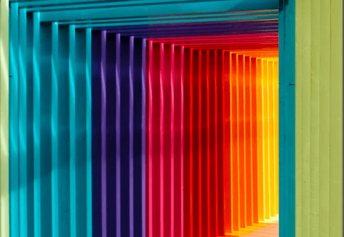
Don't be afraid of bold colours
Test colours on poster board or huge portions of a wall to gain confidence. Don’t be scared to push yourself outside of your comfort zone.
Consider bold, vibrant colours as a main or accent colour, or soothing, deep neutrals like chocolate brown or olive green. Alternatively, a brighter colour on the ceiling could add drama. Tinted ceilings can completely change the appearance of a room. You can transform flat, boring walls into exciting and personal environments by using subtle or dramatic visual texture and broken colour.
Depth is added using burnished mineral/metal treatments and layered colourful glazes. Mica, copper, pewter, bronze, and, of course, tarnished silver and gold are examples of softly reflecting metals. Consider walls as colour planes, and observe how they interact when viewed side by side in adjacent rooms. Approach it as if it were a painting: you’re in one room, but you’ll see a piece of another room through it. As you choose colours, think about how they’ll flow from room to room to complete your picture.
Using a colour wheel can sometimes help
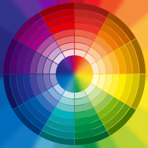
When wanting to use two or more colours, a colour wheel is an excellent reference tool. Red and green, for example, are most powerful when used together since they are complimentary (opposite) colours. You could be surprised by how many colour combinations work well together, and you might even be drawn to totally new colour palettes. The colour wheel also depicts a colour’s perceived temperature. Draw a line from the yellow-green mark on the colour wheel to the red-violet mark, and you’ll notice that the colours on the left are warm, while the ones on the right are cool.
If you think one colour is uninteresting, use contrasting paint finishes to create striking or subtle differences within one colour group. Use closely comparable colours for walls and trim in one room, or try a single colour in various finishes. Choose a warmer (more towards reds) or cooler (more towards blues) colour to compliment your main colour group as an accent colour.
Make sure your colours aren’t too bright to create a calmer atmosphere. When utilised as trim with a monochromatic colour group, white or an off-white tint can be a stunning accent. When a single hue is utilised on walls and trim in various finishes, it takes on new meaning. For example, keep the colour of the walls and trim the same, but apply an eggshell (matte and less reflective) treatment to the walls and a satin or semi-gloss finish to the trim. Each surface will have a slightly distinct colour.
It’s a good method to create a unified effect in spaces with a lot of windows and doors and a small amount of wall space.
Contact Us

We're Ready, Let's Talk.
Contact Info
Address
PO Box 784, Muswellbrook, NSW, Australia, 2333
Email Us
admin@glzwoodw.biz
Call Us
0448 687 451
Follow Us